
Canterbury Christ Church University
Refreshed brand identity for a university rich in history, community and faith.
CCCU has a long-standing history of continually responding to workforce needs and shortages, so much so that they were voted number one for UK graduate employment. But despite having such a strong foundation and ethos they recognised there was something missing in how they were communicating all that they offer. CCCU’s Vision 2030 report made certain aspects clear, who they are and how they need to communicate. They pride themselves on both their employability and their community spirit, that they embody the spirit of both the head and the heart, and that is what fuelled and inspired the project.
Pursuing the idea of ‘head and heart’, using it to direct and inspire a brand refresh and recruitment campaign that highlights CCCU’s welcoming, confident personality and progressive nature. Taking what CCCU already had it was made to work harder, made it ‘digital-first’ and symbolise the energy and ambition of their Vision 2030 report – pushing the brand to come to life with dynamism, while also sitting comfortably at the beating heart of all that they do.
With this brought the evolution of the Trinity logo, defined a strong sense of identity and personality throughout all aspects of their brand. Creating an exciting and attention-grabbing campaign and a toolkit with guidelines to enable consistency moving forward.


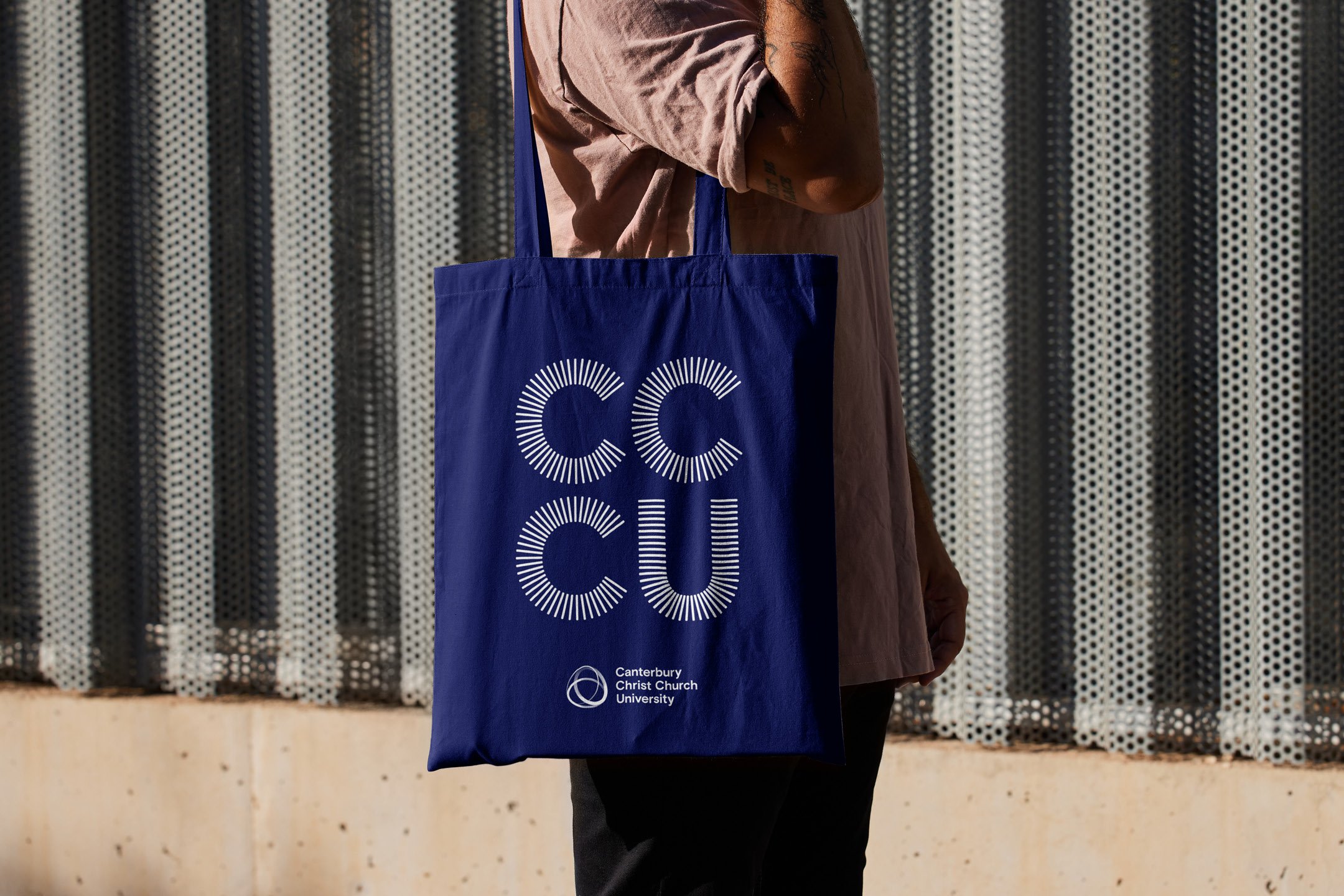

Abbreviating the name
Canterbury Christ Church University has always struggled with how external and internal audiences refer to them. With a long name people have abbreviated them in several different ways over the years - Canterbury, Christ Church, Canterbury Christ, CU to name a few. Within the brand identity the university name was abbreviated to simply CCCU. An accompany marque was created to always work alongside the full logo as well as a new campaign typeface CCCU sans. Added to the wider toolkit to give the university stand out and much needed brand recognition moving forward.


Increase in sign ups and attendees
All-time high for experience vs expectation
4/5 people believed the format has set CCCU apart from competitors


Thank you
Huge thanks to Vice-Chancellor and Principal, Professor Rama Thirunamachandran DL, Deputy Vice-Chancellor Professor Alison Honour, Director of Marketing Marco Keir and the rest of the marketing department.
Design direction • Brand development • Logo design • Campaign delivery • Print management • Bespoke typeface